






There’s a photo making the rounds – allegedly from an Apple store or office – where the fire extinguisher has been so perfectly hidden behind a flush white panel that you’d never know it was there unless someone told you. And people are calling it genius design. That’s the part that gets me.
There’s a photo making the rounds – allegedly from an Apple store or office – where the fire extinguisher has been so perfectly hidden behind a flush white panel that you’d never know it was there unless someone told you. And people are calling it genius design. That’s the part that gets me.
When Branding Becomes a Blindspot
Look, I get it. Apple has trained us to worship at the altar of clean lines and invisible seams. Their stores are temples to minimalism, and we’ve all bought into it. I mean, who doesn’t want a workspace that looks like it belongs in an architecture magazine?
But here’s the thing – there’s a difference between hiding the charging cables and hiding the thing that’s supposed to save your life when the building’s on fire.

The image that’s been circulating (and I can’t verify if it’s actually Apple or just something that looks like their aesthetic) shows fire suppression equipment integrated so seamlessly into the wall that it basically disappears. No red. No signage. No visual indication whatsoever that emergency equipment is there. It’s just… wall.
And people are praising it. That’s what I can’t wrap my head around.
OSHA Doesn’t Care About Your Aesthetic
The regulations here aren’t fuzzy. OSHA 1910.157 is pretty explicit – fire extinguishers need to be mounted, located, and identified so that employees can actually find and use them without, you know, dying in the process. The whole point is visibility during an emergency.
Smoke fills a room fast. Really fast. You’ve got seconds to react, not minutes to remember which perfectly flush panel in a sea of identical white surfaces might possibly contain the extinguisher. Your brain doesn’t work the same way when you’re panicking and can’t breathe.
I’ve covered enough workplace safety stories to know that the gap between “theoretically accessible” and “actually accessible during a crisis” is where people get hurt. Or worse.
The Brand Loyalty Problem
What’s wild to me is how brand loyalty short-circuits critical thinking. If this were any other company – let’s say a random corporate office park – people would rightfully call it out as dangerous. But slap an Apple logo on it (or even just the suspicion of Apple involvement), and suddenly we’re falling over ourselves to justify it.
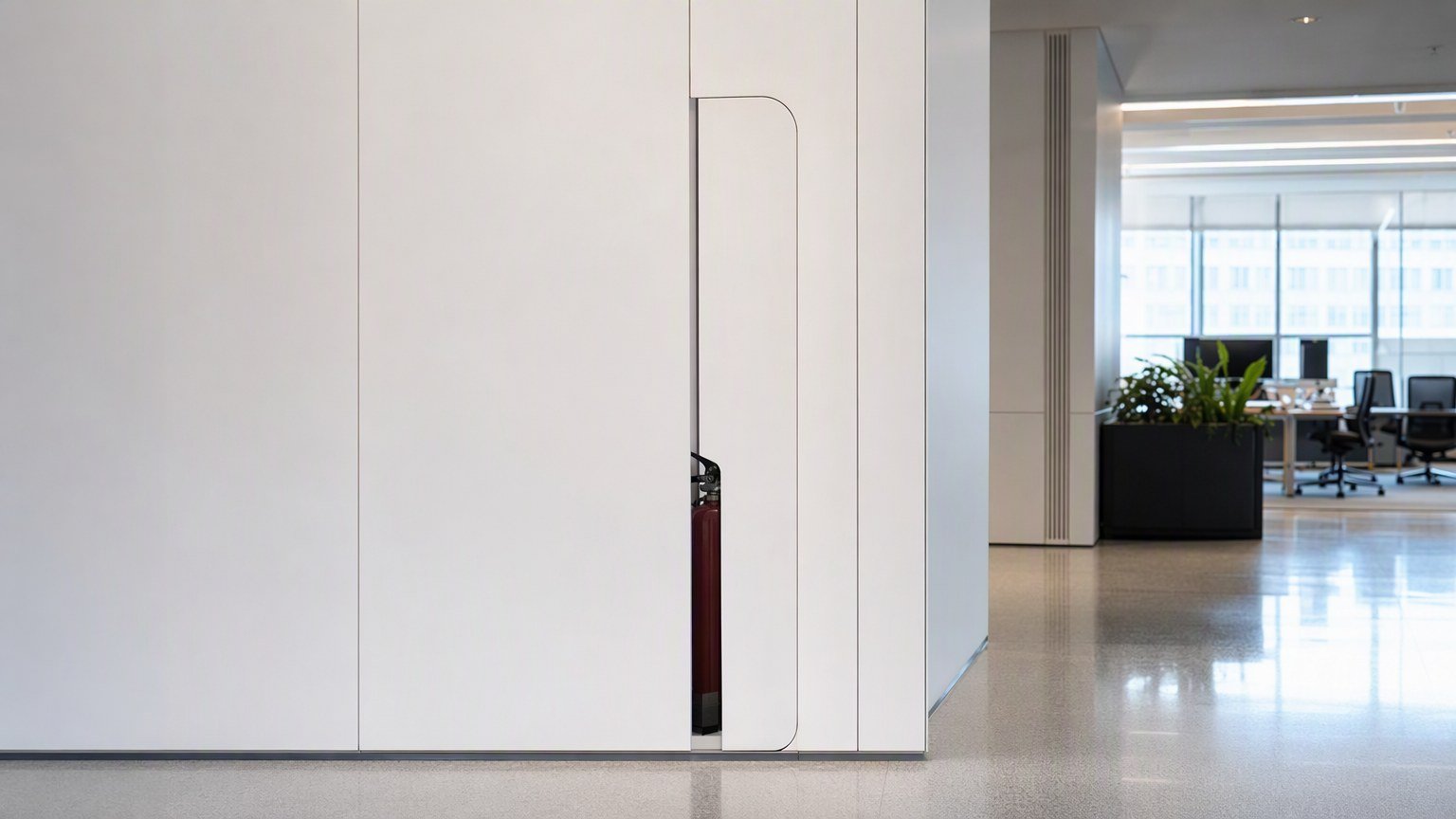
“Oh, but employees would know where it is.” Would they though? What about visitors? Contractors? The new hire on their second day? What about when that employee who knew is home sick and someone else needs to find it while the smoke alarm is screaming?
“A clean wall that conceals emergency equipment without any visible identification is not good design. It is a functional failure dressed up in a coordinated finish.”
Design Has Responsibilities Beyond Looking Good
I’m not anti-design. I’m really not. Clean environments are great. Minimalism has its place. But design exists in service of function, not the other way around. The moment your aesthetic choices actively undermine the core purpose of an object or space, you’ve failed as a designer.
And let’s be honest – this isn’t even about Apple specifically at this point. It’s about a broader cultural problem where we’ve decided that looking good is more important than working well. Where we’ve confused “invisible” with “better.” Where we optimize for the Instagram photo instead of the emergency scenario.
You see it everywhere now. Stoves without visible controls. Doors without handles. Interfaces without buttons. And now, apparently, fire safety equipment without any indication it exists. The same instinct for hiding risk instead of fixing it shows up elsewhere too, like the hidden danger behind period tracking apps.
What This Actually Means
The scary part? This kind of thinking is spreading. Once one prestigious company gets praised for hiding safety equipment in the name of aesthetics, others will follow. We’ll see more of this, not less. Because if Apple (maybe) did it, it must be innovative, right?
Wrong.
There’s no verified statement from Apple about this specific installation. No architectural drawings have surfaced. No official confirmation. But it almost doesn’t matter at this point. The conversation itself reveals something broken in how we think about design trade-offs.
When a room catches fire, you don’t have time to appreciate the clean lines. You need the bright red cylinder with the obvious label that screams “HERE, GRAB THIS.” That’s not boring design. That’s design that respects the reality of human behavior under stress.
Maybe it’s time we stopped confusing “invisible” with “sophisticated” and started asking whether the things we’re hiding should actually stay visible. Because some things – like the equipment meant to keep you alive – deserve to interrupt your sightlines.