


The Button Backlash is REAL, People
And then, just when you’d about given up hope, when every new car reveal looked like a rolling iPad commercial, Volkswagen drops a bombshell. A good bombshell. They’re bringing back physical buttons. Real ones. On the dashboard. For their new ID. Polo EV.
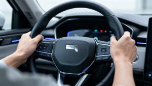
You read that right. Buttons. Actual, honest-to-god, pressable, clicky buttons. Not haptic feedback nightmares, not gesture controls that only work half the time, not a tiny little icon you have to tap three times while going 70 mph down the highway just to turn on the damn seat warmer. No, this is about real, physical controls. Engadget broke the news, and frankly, it’s not just news, it’s a public service announcement for sanity.
Look, this drives me nuts. I’m not some Luddite who hates technology. I’ve got a smartphone glued to my hand, a smart home that probably judges my snack choices, and I embrace innovation. But there’s a line. And that line, for me, has always been drawn right through the middle of a car dashboard. A car is not your living room. It’s not your office. It’s a tool for getting from point A to point B, hopefully without killing anyone (or yourself) in the process. And anything that makes that job harder, more distracting, or just plain frustrating, needs to go.
And that’s what these giant touchscreens have become. A massive, gaping distraction. You want to adjust the fan speed? Okay, first, find the climate control menu. Then, find the fan speed icon. Then, carefully, carefully, slide your finger across a smooth, unresponsive surface, all while your eyes are off the road. It’s a recipe for disaster. It really is. My old clunker, I could reach down, feel the knob, turn it, all without looking. Instinct. Muscle memory. Safety. Remember those?
VW’s Rocky Road to Redemption
Volkswagen, bless their hearts, has been a particularly egregious offender in this whole touchscreen madness. Remember the current Golf? The ID.3, ID.4? Oh man. They went all in on the touch controls, especially those infuriating haptic sliders under the main screen. The ones that didn’t light up at night? The ones you had to swipe just so, to adjust volume or temperature? They were universally panned. And I mean universally. Car reviewers hated them. Owners hated them. I even hated them just reading about them. It was a usability catastrophe, plain and simple.
And for a company that built its reputation on solid, sensible, user-friendly cars – the Golf, the Polo, the Beetle – it felt like a betrayal. They were chasing some kind of sleek, minimalist, “futuristic” aesthetic, and they completely forgot about the “user-friendly” part. They were chasing Tesla, basically, and tripping over their own feet in the process.
So, What Took So Long? And Is This Just a Tease?
This change with the ID. Polo EV isn’t just a minor tweak. It’s an admission. A big, fat, flashing admission that they got it wrong. Really, really wrong. But wait, why now? And why on the ID. Polo EV, specifically? The Polo is a smaller, more accessible car. It’s the kind of car that needs to be practical, no-nonsense. Maybe they’re testing the waters. Or maybe, just maybe, they’ve finally listened to the mountains of complaints.
Here’s the thing about car design: sometimes engineers and designers get so caught up in what can be done, they forget what should be done. It’s like they see a cool new piece of tech – a huge capacitive screen, for instance – and think, “Okay, how can we cram everything into this?” without ever asking, “Is this actually better for the person driving the car?” The answer, more often than not, was a resounding “No.”
“Nobody ever said, ‘Gosh, I wish I had to stare at a screen to turn on my wipers.’ Said no one ever. Except maybe a UX designer who never actually drives.”
The Meat of It: Safety, Sanity, and Common Sense
This isn’t just about personal preference, though I have strong feelings, obviously. This is about safety. Numerous studies have shown that interacting with complex touchscreens while driving is more distracting than using physical buttons. It’s a cognitive load issue. You have to look at the screen to orient yourself, then look at the specific icon, then look at your finger to make sure it’s hitting the right spot. With a physical button or knob, you can often find it by touch, keep your eyes on the road, and make the adjustment. It’s a no-brainer.
And honestly, it’s about basic ergonomics. Humans are tactile creatures. We like to feel things. We like feedback. A button that clicks or a knob that turns gives you instant, satisfying feedback. A flat pane of glass gives you… well, it gives you a smudge and maybe a subtle vibration if you’re lucky. It’s like trying to type a novel on a flat piece of glass instead of a proper keyboard. It’s just not the same. It’s inefficient. It’s annoying.
What people are missing here is that this isn’t just a styling choice. It’s a fundamental decision about how a car interacts with its driver. Are you designing a car for a showroom, where it looks sleek and futuristic? Or are you designing it for the real world, for real people who have to drive it every single day, in traffic, in the rain, with kids screaming in the back? For too long, it felt like car companies were prioritizing the former.
What This Actually Means
My honest take? This is a win. A big, fat, resounding win for common sense, for drivers, and for anyone who’s ever cursed their car’s infotainment system. It means that somewhere, finally, someone in a position of power at VW – and hopefully at other car companies – realized that sometimes, the old ways are the best ways. Or at least, they’re the safer ways.
I predict this isn’t just a one-off. VW is a massive player, and if they’re making this shift, others will pay attention. We’re probably going to see a slow but steady resurgence of physical controls across the industry. Maybe not a full reversion to the 90s, but definitely a more thoughtful integration of screens alongside crucial physical controls. The pendulum, it seems, is finally swinging back. And thank goodness for that, because frankly, I was getting tired of driving around in what felt like a giant, dangerous smartphone. Cars should be about driving, about the road ahead, not about endlessly swiping.